The brief here was to design the brand identity for a florist. This small business takes pride in providing beautiful bespoke orders for any special occasion.


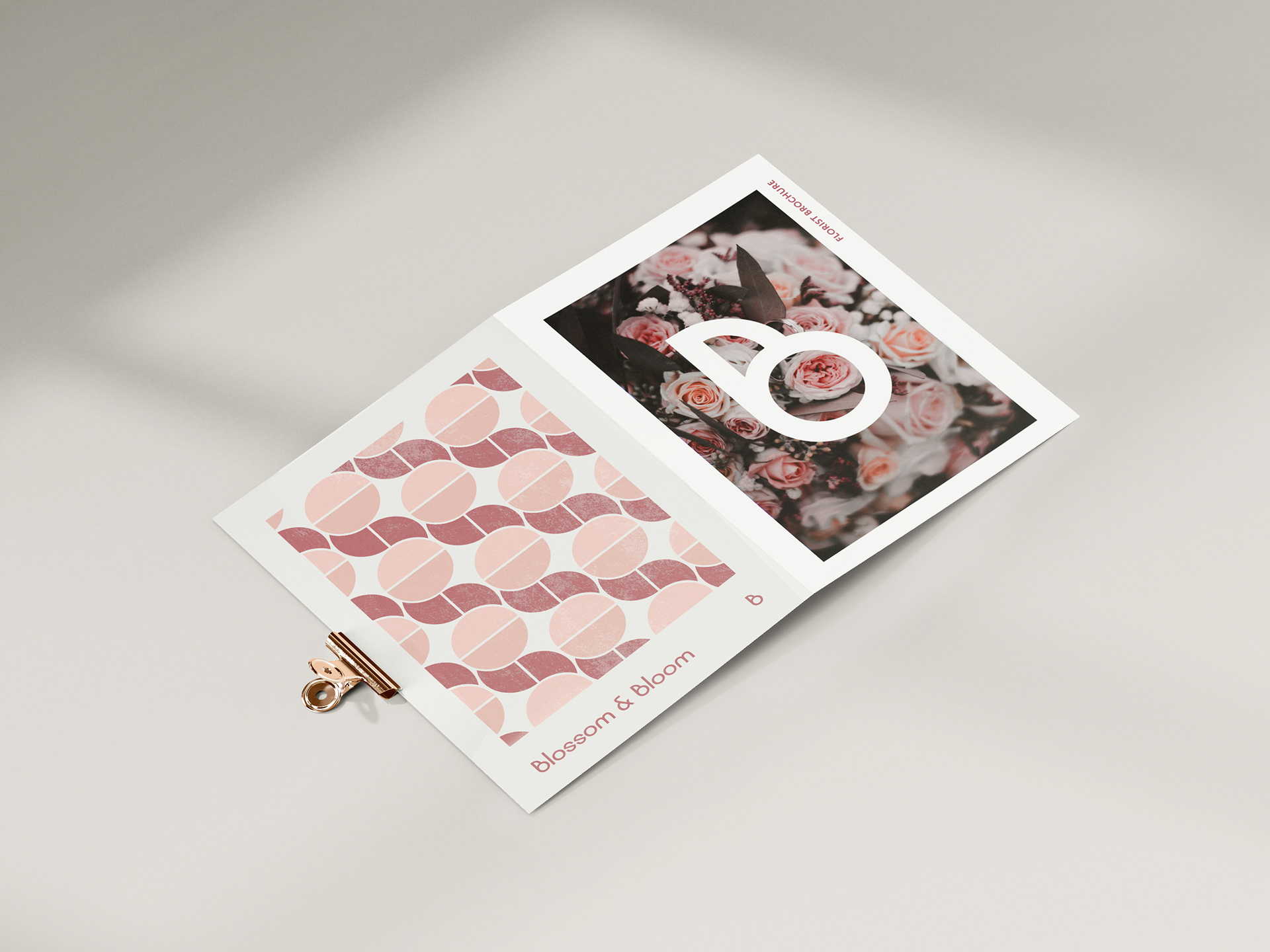
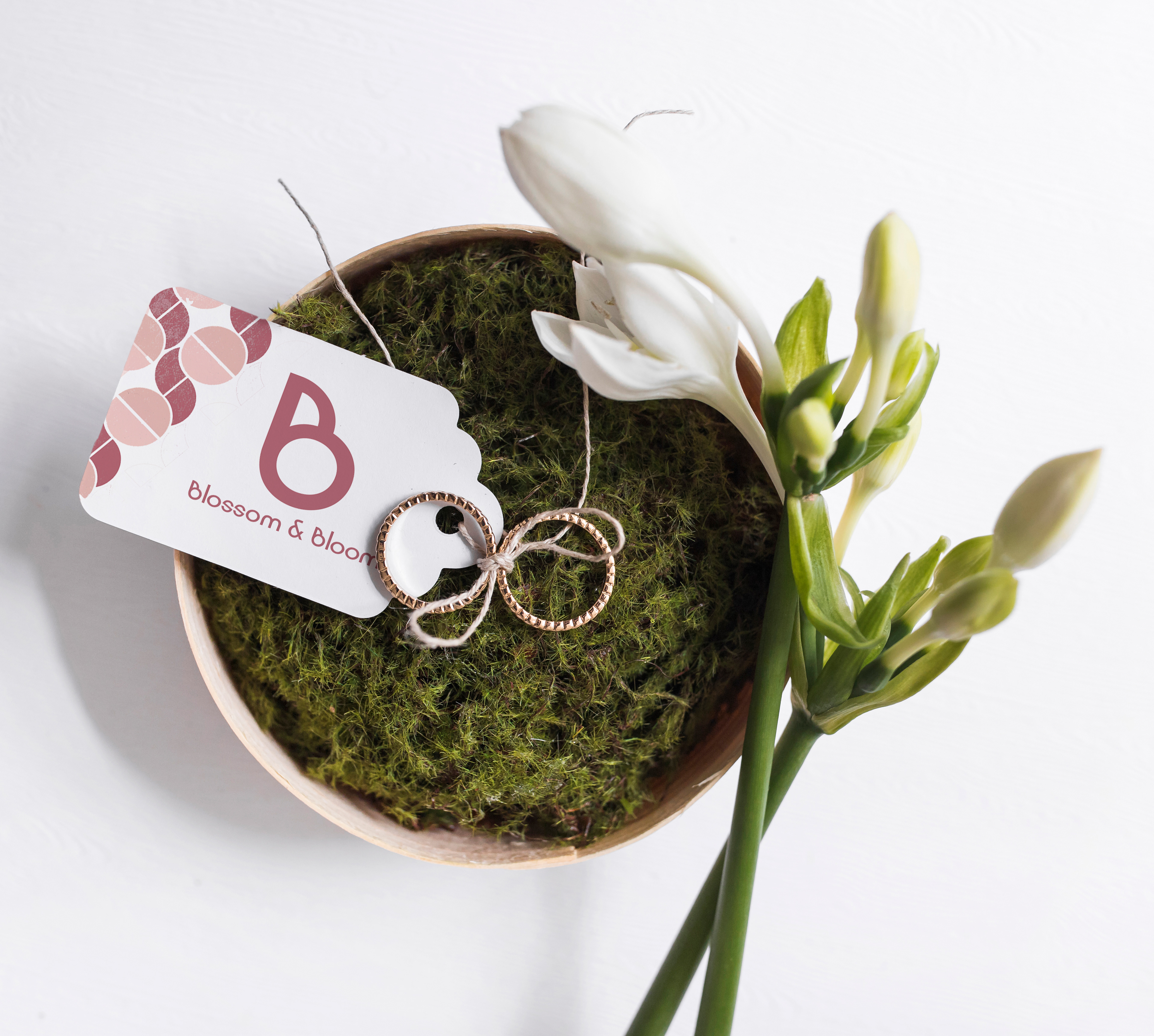
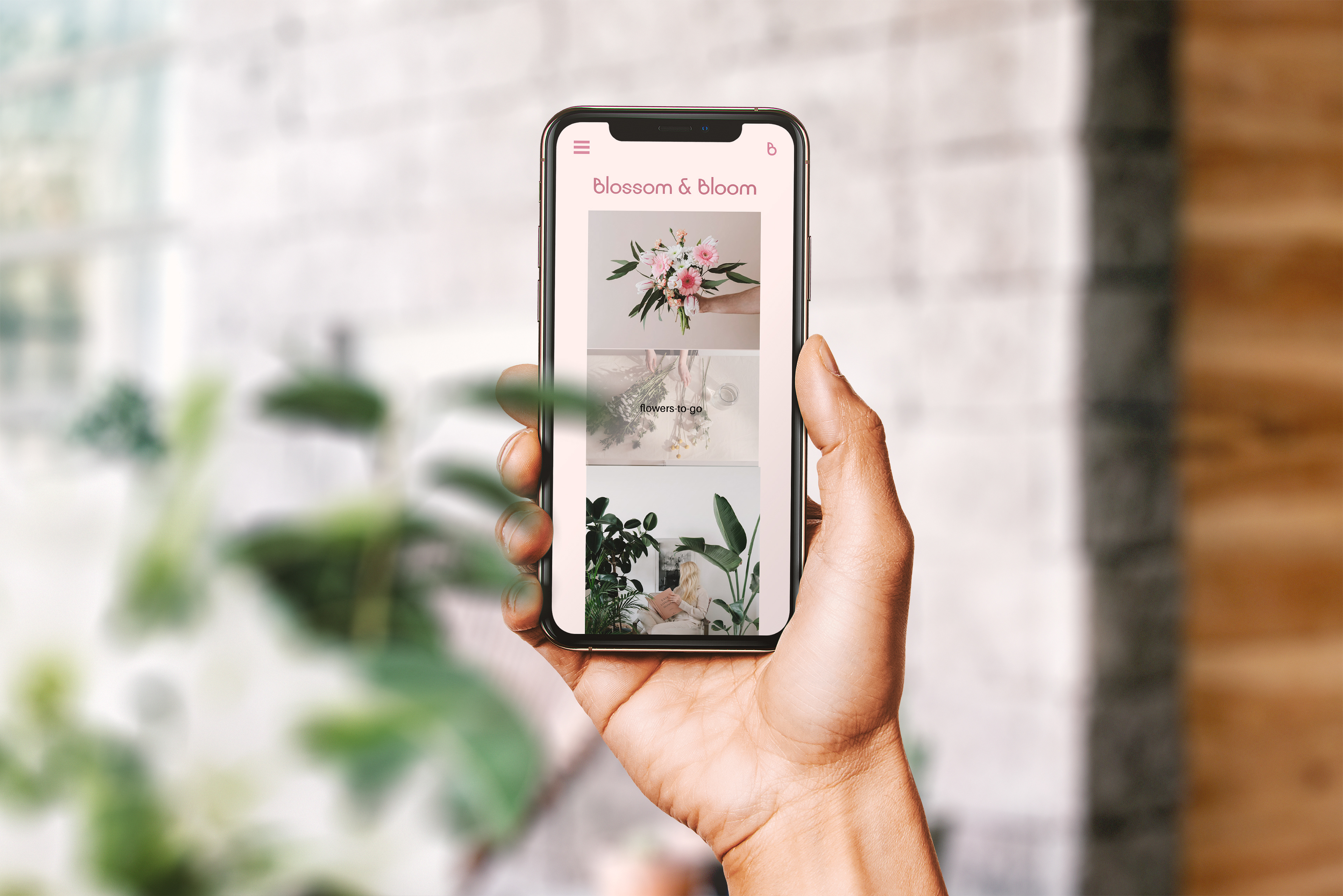
I provided a logo which is striking and elegant, which reflects the high quality this business provides. The letter mark “B” also represents part of a flower. Paired with a pale colour pallet and a sans serif font, this brand comes across as both professional and sophisticated.
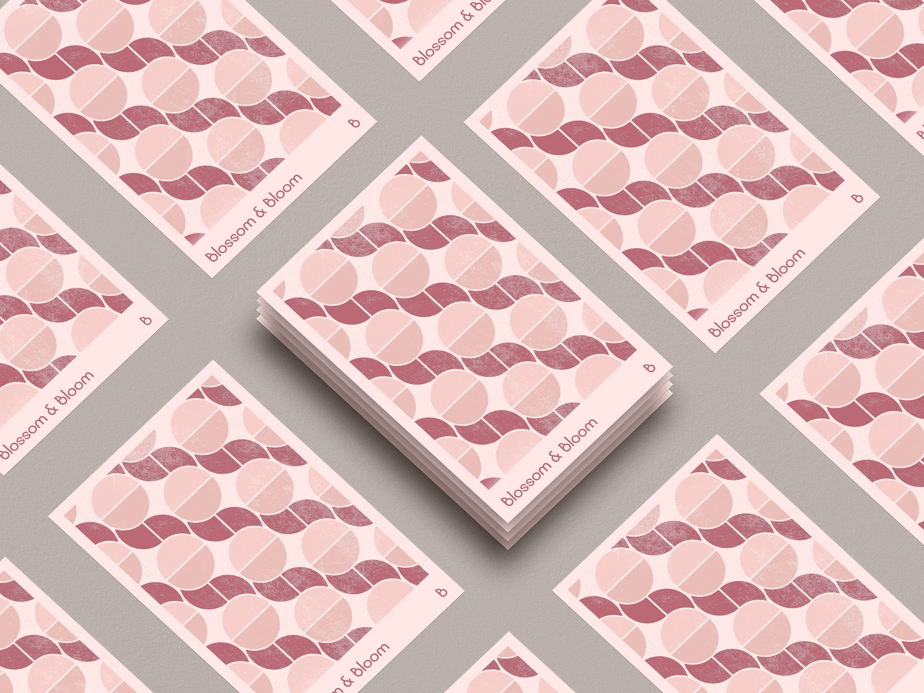
I designed a geometric flower pattern to be applied to aspects such as business cards. Using geometric shapes to form a pattern across the brand helped supply a natural, friendly and welcoming tone.
I designed a geometric flower pattern to be applied to aspects such as business cards. Using geometric shapes to form a pattern across the brand helped supply a natural, friendly and welcoming tone.